It’s sad to many of us, but gone are the days when people read the newspaper as a matter of routine.
Realizing that, The Lamp sees its namebrazened across its front page as no longer the best use of space. When people started their days with the newspaper and saw it as an essential part of their lives, the brand’s prominence was integral.
People would know that was something they needed to pick up.
Because of that, we’ve decided to make our nameplate smaller.
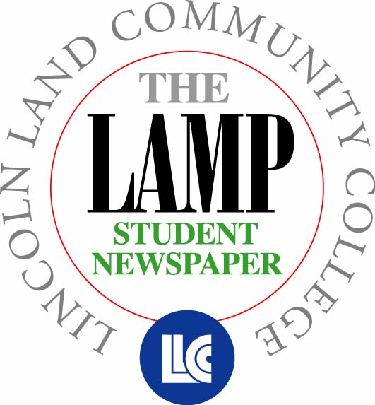
The Lamp’s nameplate, also known as the flag by many journalists, has been shrunk. Many of you will notice that it’s smaller now.
It took up almost 3.5 inches of the page before. Given the way the newspaper is folded by the printer, that is about half of the cover visible to passers-by.
We have only 8 inches to entice people to read our paper. Having the nameplate take up almost half of that space is too much.
The name alone no longer invites people to pick it up.
By keeping the flag less than 2 inches on the top of the front page, we have more room to capture attention with photos, stories, headlines and more.
We hope our regular readers will still pick up the paper, despite the change. And we hope to capture more readers, as we will now have more content visible on the front page.
The Lamp hopes to make more design changes in coming weeks, but this is our first big change. We hope you like it.
The Lamp’s editor, Ryan Wilson, can be reached at [email protected] or at 217-786-2311.


